library(tidyverse)       # data manipulation and plotting
library(glmmTMB)         # frequentist GLMMs
library(patchwork)       # multiple plots
library(marginaleffects) # marginal predictions

set.seed(333) # set seed to reproduce the simulations exactlySimulations
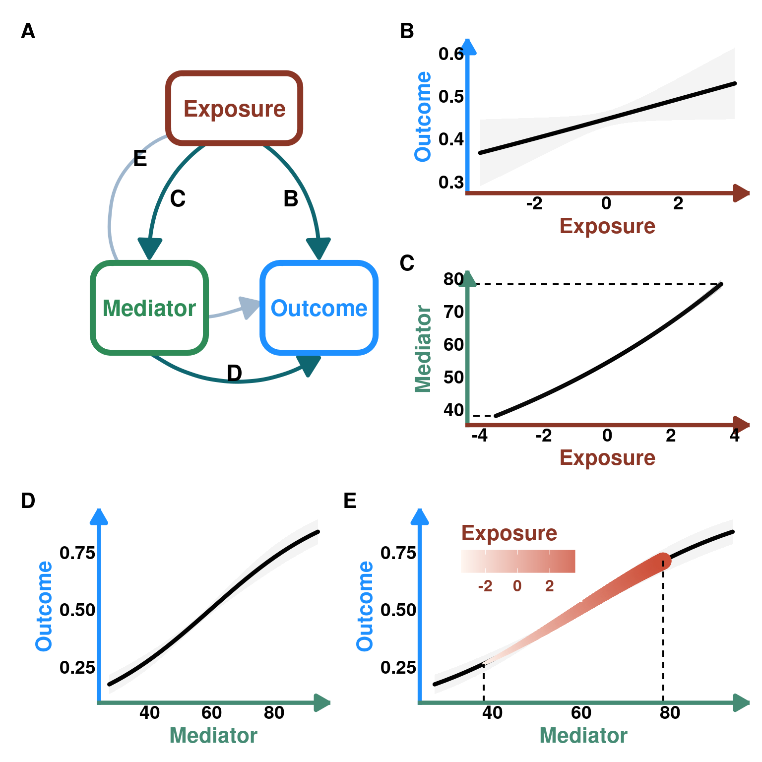
Using simulations, we will explore how to visualize indirect effects when we have an exposure, mediator and outcome variable.
Set up workspace
Load packages
DAG plotting function
#' Create a DAG plot with rounded boxes and arrows
#'
#' @param labels Character vector of length 3 with names for Exposure, Mediator, Outcome
#' @param arrow_labels Character vector of length 4 with labels for paths B, C, D, E (default: c("B", "C", "D", "E"))
#' @param box_colors Character vector of length 3 with hex colors for boxes (default: c("#B22222", "#2E8B57", "#1E90FF"))
#' @param arrow_color Color for arrows (default: "#0F6670")
#' @return A ggplot object
create_dag_plot <- function(labels = c("Exposure", "Mediator", "Outcome"),
                           arrow_labels = c("B", "C", "D", "E"),
                           box_colors = c("tomato4", "#2E8B57", "#1E90FF"),
                           arrow_color = "#0F6670") {

  # Path diagram (DAG) — rounded boxes + arrows
  # boxes: name, center x/y, width, height, border colour
  # Using wider coordinate system (0-1.4 for x) to create rectangular plot
  boxes <- data.frame(
    name = labels,
    x = c(0.7, 0.25, 1.15),
    y = c(0.8, 0.4, 0.4),
    width = c(0.7, 0.6, 0.6),
    height = c(0.14, 0.18, 0.18),
    col = box_colors,
    stringsAsFactors = FALSE
  )

  # arrow head style
  arr_closed <- grid::arrow(length = unit(0.22, "inches"), type = "closed")
  arr_open <- grid::arrow(length = unit(0.22, "inches"), type = "open")

  # Draw arrows FIRST so they appear behind boxes
  p <- ggplot() + xlim(0.2, 1.4) + ylim(0.2, 0.9) +
    # B: Exposure -> Outcome (right, curved)
    geom_curve(aes(x = 0.81, y = 0.74, xend = 1.15, yend = 0.5),
               curvature = -0.28, color = arrow_color, size = 1.4, arrow = arr_closed) +
    # C: Exposure -> Mediator (left, curved)
    geom_curve(aes(x = 0.59, y = 0.74, xend = 0.25, yend = 0.5),
               curvature = 0.28, color = arrow_color, size = 1.4, arrow = arr_closed) +
    # D: Mediator -> Outcome (bottom, long curve)
    geom_curve(aes(x = 0.25, y = 0.31, xend = 1.15, yend = 0.3),
               curvature = 0.32, color = arrow_color, size = 1.4, arrow = arr_closed) +
    # E: dashed indirect (Exposure -> Outcome via dashed curved line)
    geom_curve(aes(x = 0.62, y = 0.765, xend = 0.84, yend = 0.41),
               curvature = 1.5, color = "slategray3", size = 1.2,  arrow = arr_closed)

  # Now draw boxes on top of arrows
  for(i in seq_len(nrow(boxes))){
    bx <- boxes[i,]
    xmin <- bx$x - bx$width/2
    xmax <- bx$x + bx$width/2
    ymin <- bx$y - bx$height/2
    ymax <- bx$y + bx$height/2

    # draw a rounded rectangle as a grob and place it with annotation_custom
    rr <- grid::roundrectGrob(r = unit(0.2, "snpc"),
            gp = grid::gpar(fill = "white", col = bx$col, lwd = 6))
    p <- p + annotation_custom(rr, xmin = xmin, xmax = xmax, ymin = ymin, ymax = ymax) +
      annotate("text", x = bx$x, y = bx$y, label = bx$name,
               fontface = "bold", size = 6, colour = bx$col)
  }

  # Add labels for arrows on top
  p <- p +
    annotate("text", x = 1.00, y = 0.62, label = arrow_labels[1], size = 6, fontface = "bold") +
    annotate("text", x = 0.40, y = 0.62, label = arrow_labels[2], size = 6, fontface = "bold") +
    annotate("text", x = 0.70, y = 0.27, label = arrow_labels[3], size = 6, fontface = "bold") +
    annotate("text", x = 0.2, y = 0.7, label = arrow_labels[4], size = 6, fontface = "bold") +
    coord_cartesian(clip = "off") +
    theme_void()

  return(p)
}
Worked example
First, we will simulate data from this DAG:
Code
# Create DAG with default labels
DAG_default <- create_dag_plot() +
  xlim(0.05, 1.4) +
  theme(plot.margin = margin(t = 10, r = 10, b = 10, l = 10, unit = "pt"))
print(DAG_default)
Data
n <- 3000 # sample size
E <- rnorm(n, 0, 1) # define E as a Z-score
M <- rpois(n, exp(4 + 0.1*E)) # M is a poisson variable whose link is the log function so defining the coefficients using the inverse log (exponential)
O <- rbinom(n, size = 1, prob = plogis(-3 + 0.1*E + 0.05*M)) # O is a Bernoulli variable whose link is the logit so defining the coefficients using the inverse logit (plogis)

data <- tibble(
  E = E,
  M = M,
  O = O,
  O_1 = 1 - O
)

head(data)
# A tibble: 6 × 4
E M O O_1
<dbl> <int> <int> <dbl>
1 -0.0828 44 0 1
2 1.93 71 1 0
3 -2.05 45 0 1
4 0.278 58 0 1
5 -1.53 43 0 1
6 -0.269 62 0 1Models
We need two models: one where we regress the Mediator as a function of the Exposure. A second where we regress the Outcome as a function of both the Mediator and Exposure. ### M ~ E
mM_E <- glmmTMB(M ~ E, family = poisson, data = data)O ~ E + M
mO_EM <- glmmTMB(cbind(O, O_1) ~ E + M, family = binomial, data = data)Predictions
M ~ E
pred_M_E <- predictions(mM_E, vcov = TRUE, newdata = datagrid(E = seq(from = min(data$E), to = max(data$E), length.out = 3000))) # need many points for the visualisation of the indirect effect later on
head(pred_M_E)
     E Estimate Std. Error   z Pr(>|z|)   S 2.5 % 97.5 %
 -3.51     38.1      0.352 108   <0.001 Inf  37.4   38.7
 -3.50     38.1      0.352 108   <0.001 Inf  37.4   38.8
 -3.50     38.1      0.351 108   <0.001 Inf  37.4   38.8
 -3.50     38.1      0.351 108   <0.001 Inf  37.4   38.8
 -3.50     38.1      0.351 108   <0.001 Inf  37.4   38.8
 -3.50     38.1      0.351 109   <0.001 Inf  37.4   38.8

Type: response
Plot
pM_E <- ggplot(data = pred_M_E) +
  geom_line(aes(y = estimate, x = E),
            lineend = "round",
            linewidth = 1.5) +
  geom_ribbon(aes(ymin = conf.low, ymax = conf.high, x = E),
              alpha = 0.2) +
  geom_segment(y=min(pred_M_E$estimate),
               x = min(pred_M_E$E)*1.3,
               xend= min(pred_M_E$E),
               linetype= "dashed") +
  geom_segment(y=max(pred_M_E$estimate),
               x = min(pred_M_E$E)*1.3,
               xend= max(pred_M_E$E),
               linetype= "dashed") +
  scale_y_continuous(breaks = seq(from = 40, to = 80, by = 10))+
  theme_classic() +
  labs(title = NULL,
       y = "Mediator",
       x = "Exposure") +
  coord_cartesian(xlim = c(-4,4)) +
  theme(axis.line.y = element_line(arrow = arrow(
                                               length = unit(0.15, "inches"),
                                               ends = "last",
                                               type = "closed"),
                                   linewidth = 1.5,
                                   color = "aquamarine4"),
        axis.line.x = element_line(arrow = arrow(
                                               length = unit(0.15, "inches"),
                                               ends = "last",
                                               type = "closed"),
                                   linewidth = 1.5,
                                   color = "tomato4"),
        axis.ticks = element_blank(),
        axis.title.x = element_text(color = "tomato4",
                                    size = 16,
                                    face = "bold",
                                    family = "",
                                    lineheight = 1.5),
        axis.title.y = element_text(color = "aquamarine4",
                                    size = 16,
                                    face = "bold",
                                    family = "",
                                    lineheight = 1.5),
        axis.text.x = element_text(face = "bold",
                                   size = 14),
        axis.text.y = element_text(face = "bold",

                                   size = 14),
        plot.title = element_text(size = 16))

pM_E
O ~ E + M
Direct effect of E
pred_O_E <- predictions(mO_EM, vcov = TRUE, newdata = datagrid(E = seq(from = min(data$E), to = max(data$E), length.out = 30)))
head(pred_O_E)
     E Estimate Std. Error     z Pr(>|z|)     S 2.5 % 97.5 %
 -3.51    0.367     0.0399  9.21   <0.001  64.8 0.289  0.445
 -3.26    0.373     0.0375  9.94   <0.001  75.0 0.299  0.446
 -3.02    0.378     0.0351 10.78   <0.001  87.6 0.309  0.447
 -2.77    0.383     0.0326 11.75   <0.001 103.5 0.319  0.447
 -2.53    0.389     0.0302 12.89   <0.001 123.9 0.330  0.448
 -2.29    0.394     0.0277 14.23   <0.001 150.3 0.340  0.449

Type: response
Plot
pO_E <- ggplot(data = pred_O_E) +
  geom_line(aes(y = estimate, x = E), linewidth = 1.5, lineend = "round") +
  geom_ribbon(aes(ymin = conf.low, ymax = conf.high, x = E), alpha = 0.05) +

  theme_classic() +
  labs(title = NULL,
       y = "Outcome",
       x = "Exposure") +
    theme(axis.line.y = element_line(arrow = arrow(
                                               length = unit(0.15, "inches"),
                                               ends = "last",
                                               type = "closed"),
                                   linewidth = 1.5,
                                   color = "dodgerblue1"),
        axis.line.x = element_line(arrow = arrow(
                                               length = unit(0.15, "inches"),
                                               ends = "last",
                                               type = "closed"),
                                   linewidth = 1.5,
                                   color = "tomato4"),
        axis.ticks = element_blank(),
        axis.title.x = element_text(color = "tomato4",
                                    size = 16,
                                    face = "bold",
                                    family = "",
                                    lineheight = 1.5),
        axis.title.y = element_text(color = "dodgerblue1",
                                    size = 16,
                                    face = "bold",
                                    family = "",
                                    lineheight = 1.5),
        axis.text.x = element_text(face = "bold",
                                   size = 14),
        axis.text.y = element_text(
                                   face = "bold",
                                   size = 14),
        plot.title = element_text(size = 16))
pO_E 
Direct effect of M
pred_O_M <- predictions(mO_EM, vcov = TRUE, newdata = datagrid(M = seq(from = min(data$M), to = max(data$M), length.out = 30)))
head(pred_O_M)
    M Estimate Std. Error     z Pr(>|z|)     S 2.5 % 97.5 %
 27.0    0.174     0.0216  8.06   <0.001  50.3 0.132  0.216
 29.3    0.191     0.0214  8.92   <0.001  60.8 0.149  0.232
 31.6    0.208     0.0209  9.94   <0.001  74.9 0.167  0.249
 33.9    0.227     0.0203 11.18   <0.001  94.0 0.187  0.267
 36.2    0.247     0.0194 12.72   <0.001 120.7 0.209  0.285
 38.6    0.268     0.0183 14.64   <0.001 158.8 0.232  0.304

Type: response
Plot
pO_M <- ggplot(data = pred_O_M) +
  geom_line(aes(y = estimate, x = M), linewidth = 1.5, lineend = "round") +
  geom_ribbon(aes(ymin = conf.low, ymax = conf.high, x = M), alpha = 0.05) +

  theme_classic() +
  labs(title = NULL,
       y = "Outcome",
       x = "Mediator") +
    theme(axis.line.y = element_line(arrow = arrow(
                                               length = unit(0.15, "inches"),
                                               ends = "last",
                                               type = "closed"),
                                   linewidth = 1.5,
                                   color = "dodgerblue1"),
        axis.line.x = element_line(arrow = arrow(
                                               length = unit(0.15, "inches"),
                                               ends = "last",
                                               type = "closed"),
                                   linewidth = 1.5,
                                   color = "aquamarine4"),
        axis.ticks = element_blank(),
        axis.title.x = element_text(color = "aquamarine4",
                                    size = 16,
                                    face = "bold",
                                    family = "",
                                    lineheight = 1.5),
        axis.title.y = element_text(color = "dodgerblue1",
                                    size = 16,
                                    face = "bold",
                                    family = "",
                                    lineheight = 1.5),
        axis.text.x = element_text(
                                   face = "bold",
                                   size = 14),
        axis.text.y = element_text(face = "bold",
                                   size = 14),
        plot.title = element_text(size = 16))
pO_M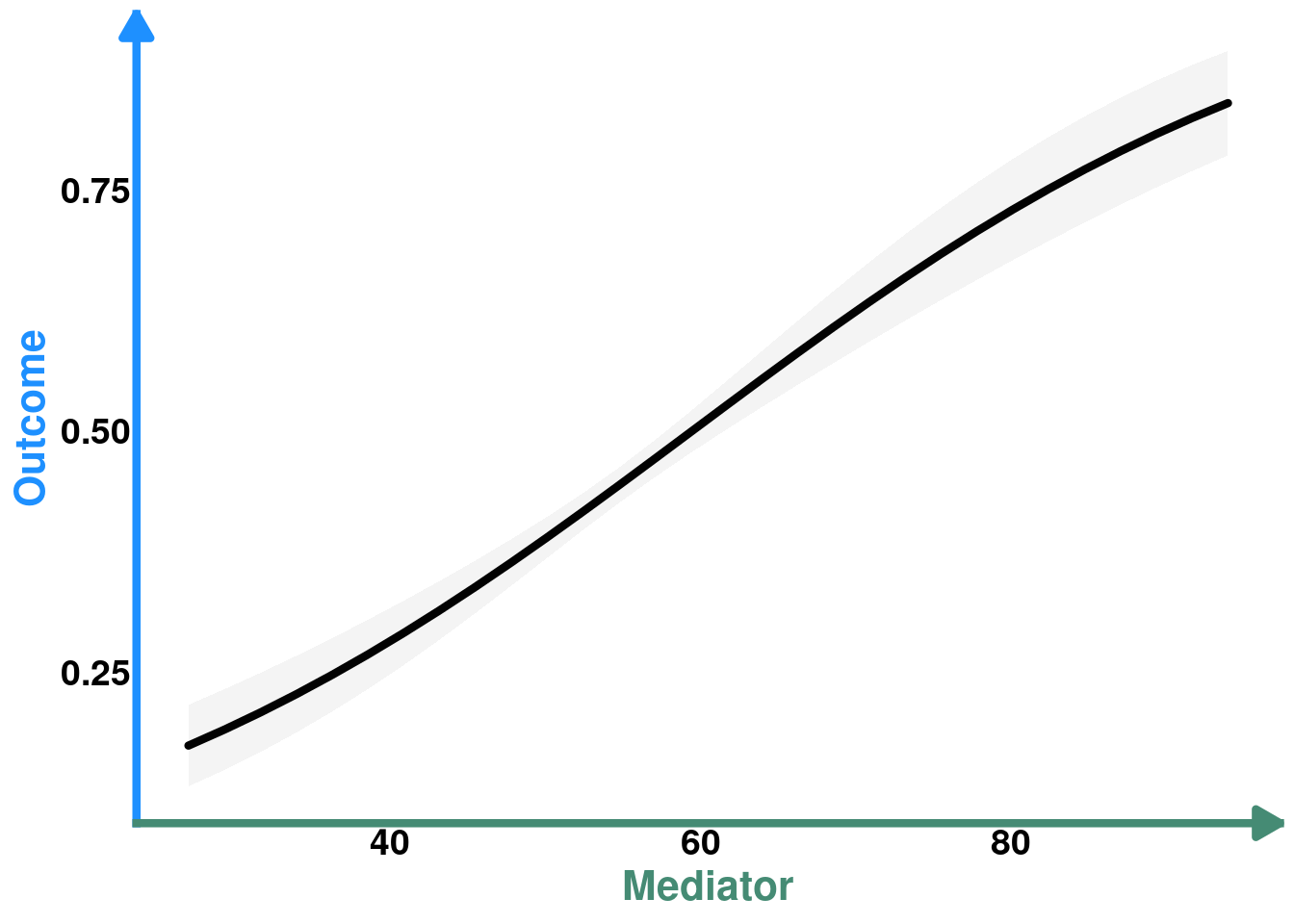
So this is the direct effect of M on O. But, remember that M is caused by E so it may be of interest to see how E affects O indirectly, through M.
Indirect effect of E
pM_E
The next step is actually quite simple. We generate predictions for O as a function of the predictions of M ~ E
pred_O_EM <- predictions(mO_EM, vcov = TRUE, newdata = datagrid(M = pred_M_E$estimate))
head(pred_O_EM)
    M Estimate Std. Error    z Pr(>|z|)     S 2.5 % 97.5 %
 38.1    0.264     0.0186 14.2   <0.001 149.5 0.227  0.300
 38.1    0.264     0.0186 14.2   <0.001 149.6 0.227  0.300
 38.1    0.264     0.0186 14.2   <0.001 149.8 0.228  0.300
 38.1    0.264     0.0186 14.2   <0.001 150.0 0.228  0.300
 38.1    0.264     0.0186 14.2   <0.001 150.1 0.228  0.300
 38.1    0.264     0.0186 14.2   <0.001 150.3 0.228  0.301

Type: response
Now, we need the values of E that were associated with the predicted values of M
pred_O_ME <- pred_O_EM |>
  select(-c(E)) |> #remove E; it's set to its mean as we don't need it
  mutate(E = pred_M_E$E)

head(pred_O_ME)
 Estimate Std. Error    z Pr(>|z|)     S 2.5 % 97.5 %
    0.264     0.0186 14.2   <0.001 149.5 0.227  0.300
    0.264     0.0186 14.2   <0.001 149.6 0.227  0.300
    0.264     0.0186 14.2   <0.001 149.8 0.228  0.300
    0.264     0.0186 14.2   <0.001 150.0 0.228  0.300
    0.264     0.0186 14.2   <0.001 150.1 0.228  0.300
    0.264     0.0186 14.2   <0.001 150.3 0.228  0.301
Now, we simply superimpose both graphs of O ~ M
Plot
COLS <- alpha(colorRampPalette(c("seashell","tomato3"))(30),0.8)

pO_ME <- pO_M + geom_line(data = pred_O_ME, aes(x = M, y = estimate, color = E, linewidth = E), lineend = "round") +
  geom_segment(x=min(pred_O_ME$M), y = 0, yend= min(pred_O_ME$estimate), linetype= "dashed") +
  geom_segment(x=max(pred_O_ME$M), y = 0, yend= max(pred_O_ME$estimate), linetype= "dashed") +
  labs(title = NULL) +
  scale_color_gradientn(colours = COLS, name = "Exposure") +
  guides(linewidth = "none") +
  theme(legend.position = "inside",
        legend.position.inside = c(0.3, 0.75),
        legend.direction = "horizontal",
        legend.text = element_text(color = "tomato4", size = 12, face = "bold", family = "", lineheight = 1.5),
        legend.title = element_text(color = "tomato4",size = 16, face = "bold", family = "", lineheight = 1.5),
        legend.title.position = "top")

pO_ME
Figure for publication
# Create right column with B and C stacked
right_col_top <- pO_E / pM_E

# Create layout: DAG on left, right column on right for rows 1-2
top_section <- (DAG_default | right_col_top) + plot_layout(widths = c(1, 1))

# Row 3 has two plots side by side
row3 <- pO_M + pO_ME + plot_layout(widths = c(0.7, 1))

# Combine all
fig_1 <- top_section / row3 +
  plot_layout(heights = c(2, 1)) +
  plot_annotation(tag_levels = 'A') &
  theme(plot.tag = element_text(size = 16, face = "bold"))

fig_1